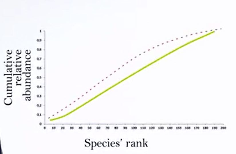
There are different ways torepresent biodiversity on a graph. One other way to represent biodiversityin a graph is the k dominance curve. K-dominance curve is a powerful tool for measuring abundance trendsin communities over time. K-dominance curve are the cumulative rankin abundance against the log species rank. In the graph on the X axis you putthe species rank, and on the epsilon axis you put the cumulative relative abundanceand you obtain the K-dominance curve.
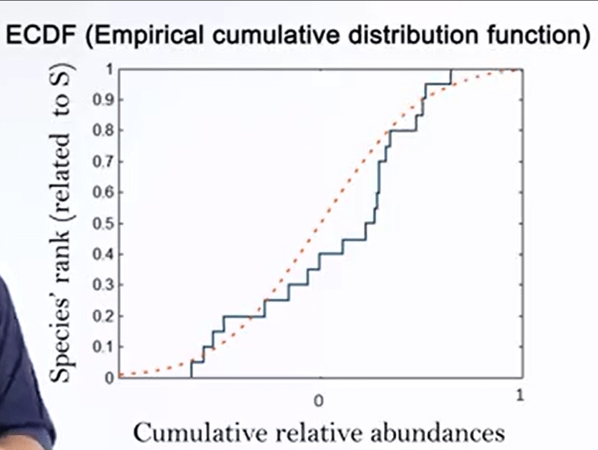
Another way to representbio diversity in the graph is the empirical cumulative distribution function. In this case you rank the abundances in growing order cumulate them and divide them for m. On the x axis you use a log scale and you match each abundance with the rank anddivide it for S. In this case you obtain a kind of steep graph. ECDF are mathematically strongerthan rank abundance as they are not influenced by species richness, and thus allow for a direct comparison between habitat, the difference of total species richness.
ect comparison between habitat, the difference of total species richness. From ECDF it’s possible to evaluate two different biodiversity features. The first one is the difference in the In this, the more is vertical the central part of the cube, the more the sample is even. And the second one is the rate of species proportion. That there’s a low left part placed higher than others, and more species.
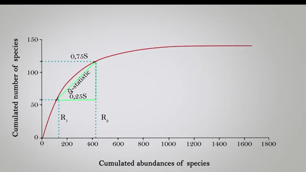
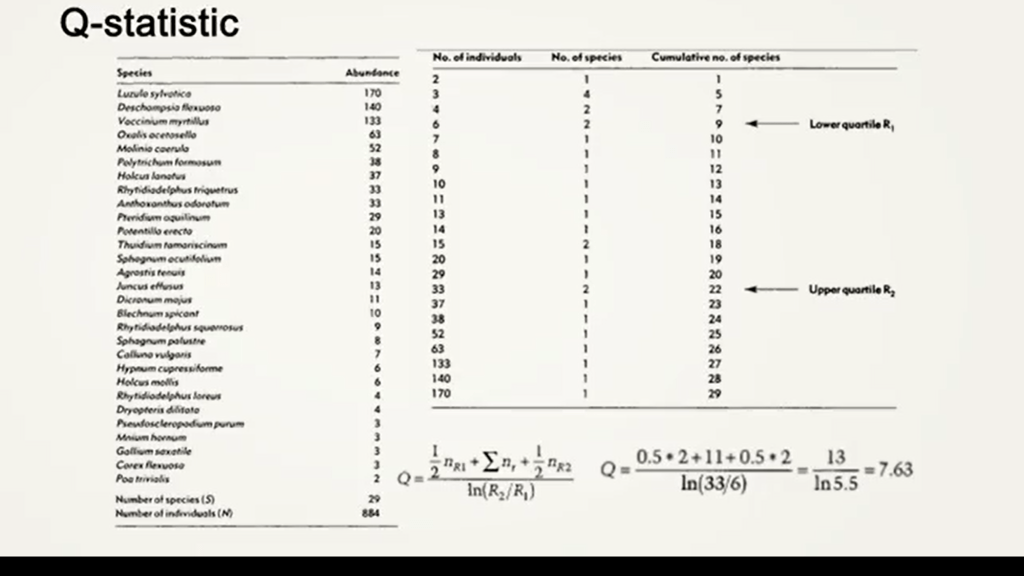
Another way to represent biodiversity in species. In this case you use look of cumulation curve that is called Q-statistic and you use the 0.25 and 0.75 to calculate this And then this can be a measure of biological diversity.
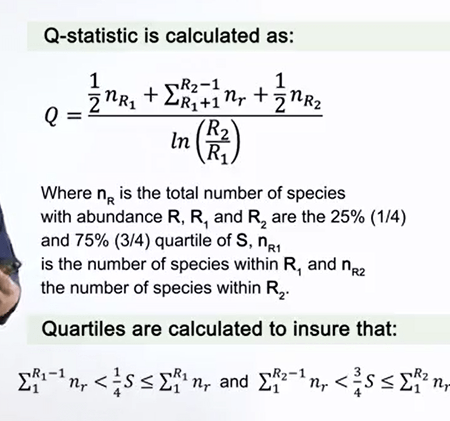
The Q-statisticis shown in the picture. You could just calculate the lower part that is in this picture, andthe upper part that is R2. So it means that you use 0.35 and 0.75 levels. And you insert these values inthe formula to obtain the q value.
A very powerful tool to understand biodiversity is the species observed. This is a relationship between the area of or part of a habitat, and the number of species found within that area. Larger area tend to contain larger number of species. And empirically, the relative number seem to follow systematic mathematical relationships.
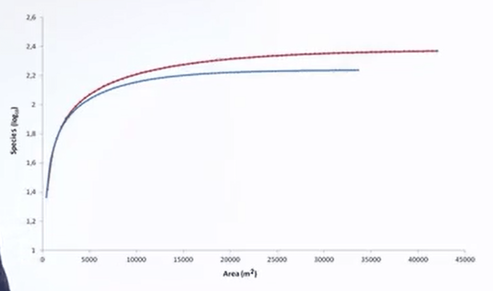
Species area curve is a kind of species accumulation curve. Because in the x axis, you put the increasing area or the increasing number of samples. And on the epsilon axis, you put the number of species. In this way, you see that there is a rise at the beginning of the curve. And then a kind of plateau. This means that we reached the maximum area that can be sampled to obtain that number of species.
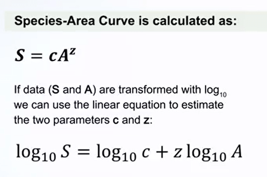
The simplest way to assess mathematically this curve is the formula s = cA elevated to zed, while S is the numberof species A is the area sampled. C and Z are two constants which characterize the site. if data S and A are transformed with log10 we can use the linear equation to estimate the two parameters c and z. You see that the equations becomelog10s is equal to log10c plus zlog10A. In this case we convert the group that we saw before in a log curve that is just aligned.
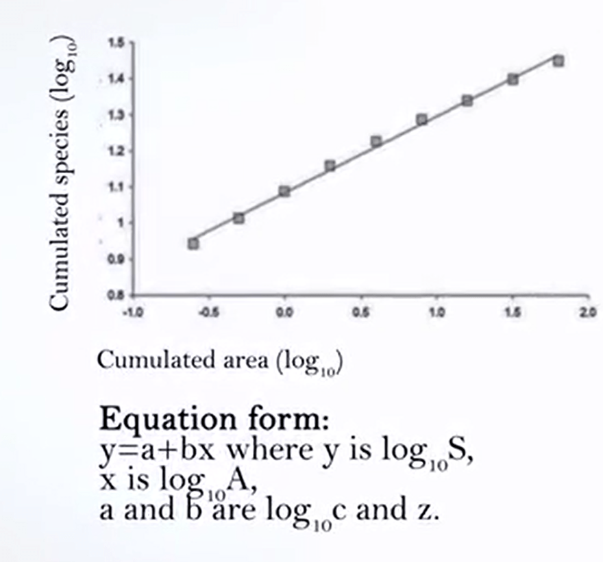
You see that the equations become log10s is equal to log10c plus zlog10A. In this case we convert the group that we saw before in a log curve that is just aligned. And from this line, from the parameters of the equation of the line we can extract the value of C and Z.
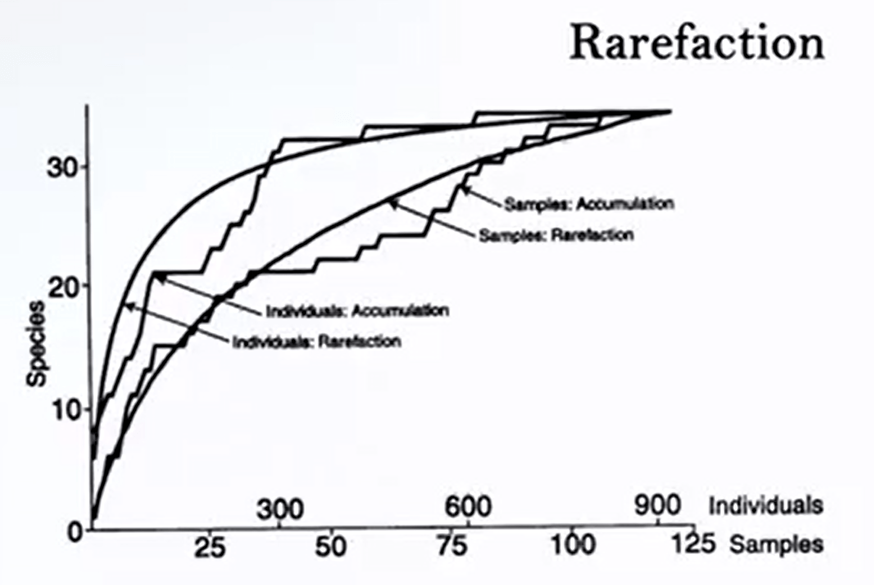
Beside the accumulation group, there are other cues that are very useful in case you want to estimate which number of species will obtain If you have a reduced number of samples. This is called rarefaction. Rarefaction is a technique to assess species richness from the result of sampling. Rarefaction allows to calculate species richness for a given number of individual samples, based on the construction of so-called rarefaction cues. This graph is just a plot of the number of species as a function of the number of sample. On the left, the steep slope indicates that a large fraction of the species diversity remain to be discovered. If the curve became flatter on the right, a reasonable number of individual sample Have been taken more and things likelyto yield only a few additional species, as in the case of species are. This means that species are an accumulation curve are read from left side to right side. As long as the number of plots are very accumulating along the sampling. Is that rarefaction curve.
All right, I read from right side to left side and this means that we can reduce the number of samples to estimate the number of species we have down. Rarefaction is used for basic abundance data estimate the number of species in 1,2,etc., samples. Until we reach t samples on the assumption that all individuals in all samples are randomly mixed. That rarefaction generates the expected number of species. It has more collection of n individuals or n samples drawn at random from the large pool of n samples. So thanks for your attention. See you in the next lecture.

Legg igjen en kommentar