Hi, guys. Welcome to a new lecture of the course Biological Diversity, Theories, Measures and Data Sampling Techniques. Today, we will talk about evenness.
First of all, we need to define what is evenness. Evenness is just the answer of the question how equally abundant are each of the species. A simple way to combine abundance and richness is just evenness.
So is the homogeneity within the sample? This is rare that all the species are equally abundant. And so, some of them are more abundant, in general, than the others. So the distribution of individuals among species is just the measure of evenness. So at the opposite two extremes of this evenness is just the dominance or rarity. Dominance, of course, is the number of species that dominate the ecosystem.
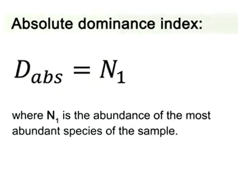
A rarity is the very rare number of species in the place and in the area where we are sampling. There are some indexes to measure the absolute dominance and one of these is just simple N1. So it’s N1 is the abundance of the most abundant species in the sample. There are relative abundance indexes. One of these is N1 divided by N, where N is the total abundance of the samples.
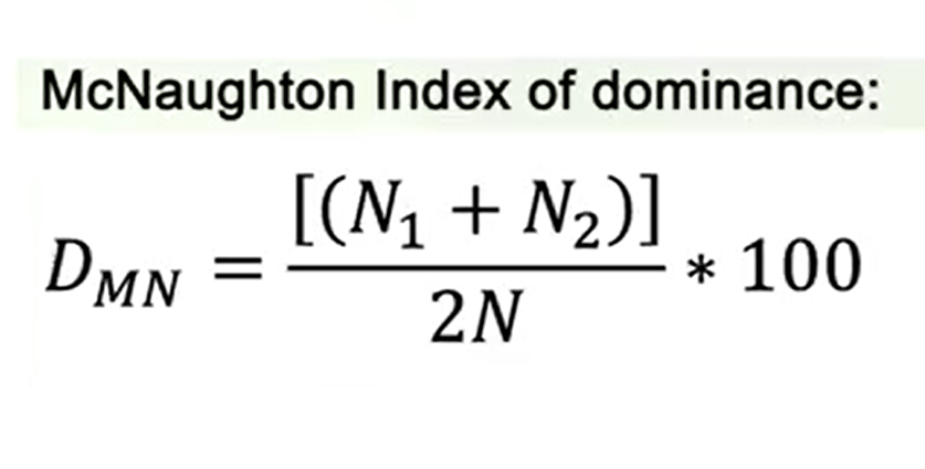
Another measure is the McNaughton index of dominance, that is N1 plus N2 divided by 2N multiplied by 100, which means that N1 is the number of individuals of the most abundant species, N2 is the number of individuals of the second abundant species, divided by the total number of species – of individuals in all species.
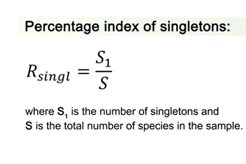
The percentage index of singletons is another way to measure rarity. And, in this case, we just measure S1 divided by S, where S1 is the number of singletons that are species represented by only one individual, and S that is the total number of species in the sample.
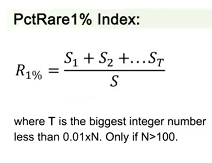
If we want to measure the rarity, we have another way that is PctRare1%. This index is just the sum of S1 plus S2 plus etc. until ST, divided by S, where T is the biggest integer number less than 0.01 multiplied by N that is the total abundance. We can use this only if total abundance number is more than 100
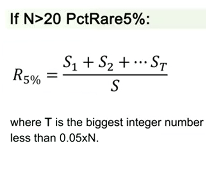
But if N is more than 20, we can use PctRare5%. In this case T is the biggest integer number. The formula is the same of the previous one, but where T is the biggest integer number less than 0.05 multiplied by N.
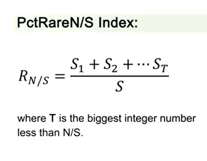
The last index of rarity that we can use is the PctRareN/S Index where on the exponent we use S1 plus S2 plus ST divided by S, where T is the biggest integer number less than N, divided by S, where N is the total abundance and S is the total richness.
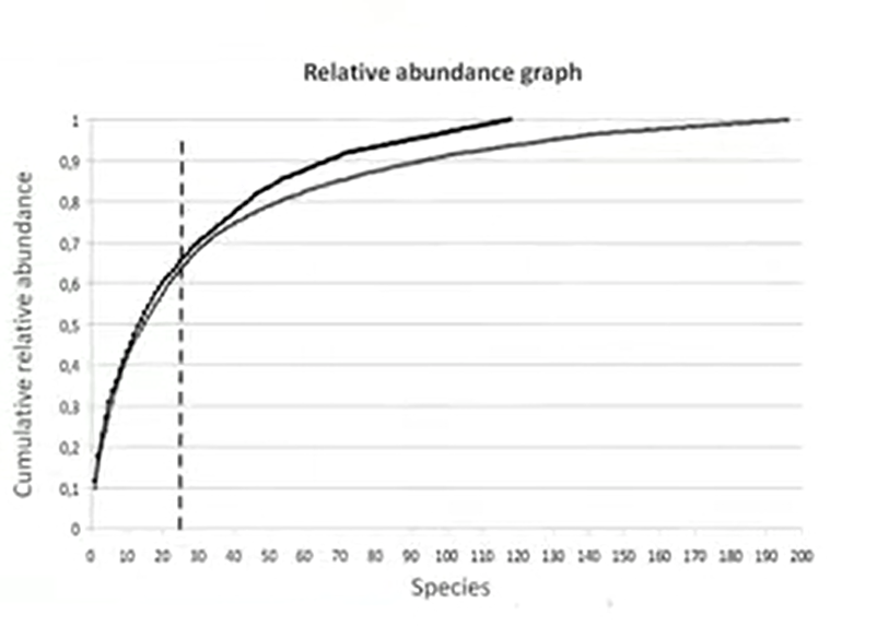
A way to represent the dominance and rarity is the relative abundance graph. In this graph, we put on the abscissa the species number and on the ordinate the cumulative relative abundance. And what we can find in the curve, the inflection point, this point is the point that’s split in two parts; species that are dominant and species that are rare. So we see that as much the line, the imaginary line that we can build on the inflection point is shifted to left, the less rare species we have in the sample.
On this graph that you see in the picture, this inflection point reaches almost 25 species.
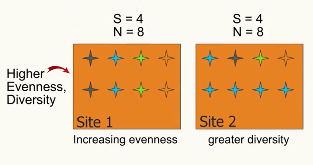
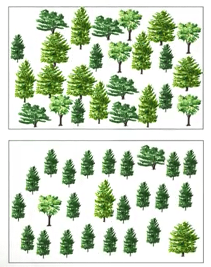
Evenness increases diversity. In fact, when we have more evenness, we have greater diversity. This is true for all indices. For instance, in the example in the picture you see that we have the same number of species, four, and the same number of individuals. But in the sample where the homogeneity, so the evenness, is higher, also the diversity is higher.
That is also a kind of paradox, the paradox of enrichment, where a polluted side for, instance, that are enriched by nutrients show an higher biodiversity. But, in general case, [inaudible] are more aged species. So it means that a simple biodiversity and with the dominance of a few ecological species, that means that numerically abundant in dominance and in the number of individuals, but not in the number of species.
It is important to understand that, between ecosystem, comparability is usually not possible. It means that some areas have lower biodiversity naturally than others. And this is normal. For instance imagine tiger, that is not really much less even than the deciduous forest, and that’s dominated by a single species, for instance, blue spruce. Seasonality also may confound the comparison as well. Earlier in temperature growing season for instance it means that less even then later. So it’s important to keep in mind that we cannot compare different ecological areas in this case. But if we want to have kind of comparison anyway, we need to try to prioritize areas for conservation that they are based largely on biodiversity, so not ecological uniqueness. So evenness in this case could be a good representation. And we can use different ways to represent this.
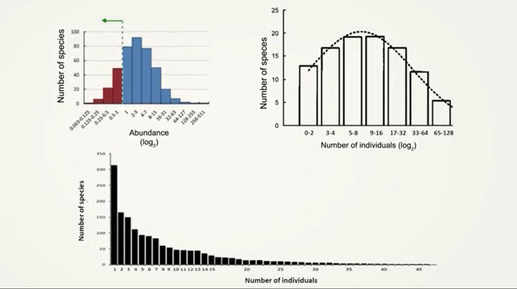
For instance we can use a log2 as the number of individuals in a graph in a histogram, while we put on the abscissa the number of individuals according to log2, and on ordinate the number of species. Or, at the same time, we can see that if we don’t use the log2 but we use just the number of individuals, the histogram will be shifted with the high abundant species on the left. This was noticed at the first time by Preston that suggested the idea of veil line, where the veil line is just the line that hide the rare part of the species. So all the left of this graph is completely hidden because of these rare species are not sampled. Useful representation of the evenness are the Rank Abundance Plot or Dominance Diversity Curve that are also called Whittaker Plot.
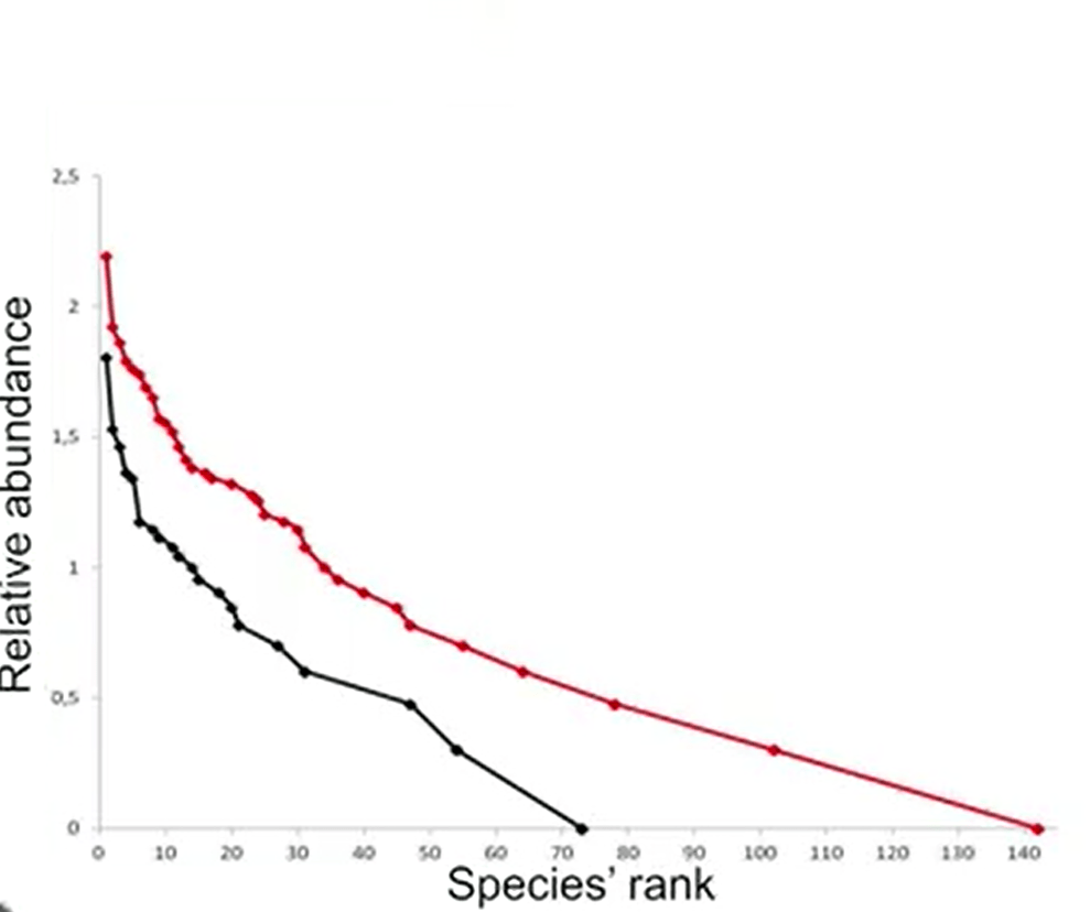
The Rank Abundance, Plot that I will explain you later, is just the species rank put in on the abscissa and the relative abundance that are put it on the ordinate. From the trend of the curve we can understand the evenness of the species. In particular, if the central part of the curve was more or less sloped, we can understand if there is more or less homogeneity in the samples. So thank you for your attention. I’ll see you at the next lecture.

Legg igjen en kommentar